
Logo Design
The first step I took in overhauling the company's identity was the logo as I felt it would set the mood for the rest of the redesign. When I start working on a project, I'll start with rough thumbnails on paper. They'll be quick iterations with enough detail to get the idea across and experiment with different directions and elements. From there, I'll combine the best elements and shapes and add more detail when necessary. Finally, I'll make a polished vector graphic with a few different color ways. Here, I decided to stick with black and white - nice, neutral colors that would let the product take center stage.
Website Design
Next, I did the package design. Looking at the company's best selling products over the years, I noticed a lot of stripes, polka dots, and flowers. Again, I kept the color palette black and white here, but mainly to keep production costs down. I chose the sunflower as it was the most easily readable flower shape at any scale, which gave me some freedom as I moved it
around the design and repeated it. The polka dots


made a nice background cover without overpowering anything else added on top. To balance the negative space of the polka on the bag, the logo is sized as widely as possible. On the box, the two shortest sides are done in reverse - black background with the white logo and instead of polka dots, I used the sunflower to tie in with the rest of the packaging.
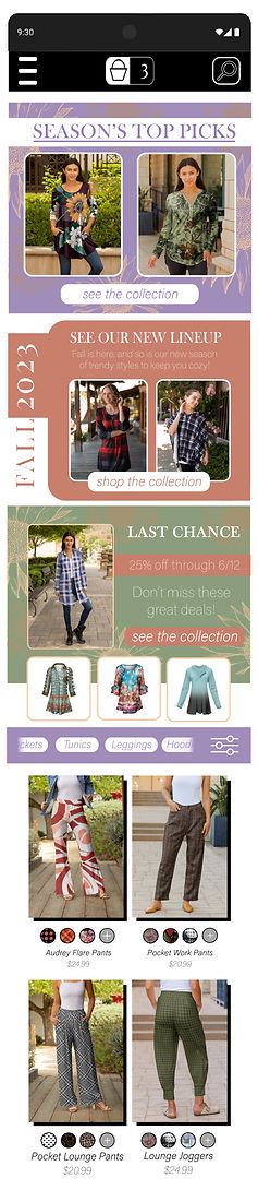

I started with the desktop (pictured below) so I could focus on getting all the necessary elements down and larger cards designed before trimming away for a mobile site. I kept the black and white theme for the top navigation bar for both keeping it in the background of the viewer's attention while also maximizing the contrast and readability. I decided on this color palette to create a sense of femineity while keeping the colors modern and related to the color palette of the year.
Once I had the desktop version and all my cards designed, I worked on trimming them down to fit on a mobile format without losing the key points (new seasonal, last chance sale). The top navigation bar was instead moved to the hamburger menu on the upper left, as well as a side scrolling menu in the shopping area.
Package Design
Internal Communications


New employees need to be caught up quickly, but with so much information at once they can easily forget things. Enter the new employee brochure. While not containing specific how-to information about the editing process, it's meant as more of a reference to help the employee remember back to their training as well as a brief introduction to a behind-the-scenes look of the entire pipeline and their place in it. Here are a few pages of it - the cover, as well as two side by side sections. To keep it in line with the established identity, the background is kept neutral, with any color meant to highlight headlines or tips. The polka dot pattern shows once again here, but kept to neutral background colors so as not to detract from the text but still fill negative space.
Newsletter
Newsletters are making a comeback lately. As such, Firmiana needed one that focused on fashion, latest trends, and style tips that showcased their products. Taking advantage of automation processes, a personalized section is included based on their history, creating another opportunity to make a sale as well as maintaining the brand connection to the customer. As with the internal communications, the background is kept neutral (white here) to keep the focus on the clothing itself. Any color used is to separate headlines and organize the space, as well as highlight certain areas. The polka dot elements are present again, as well as the sunflower. To break up the static blocks, various methods are used. On the top, the sunflower moves over both text blocks, tying them together visually while the background colors keep them separate. As with the website, headline backgrounds run the width but are visually separated from the pictures they intersect.

The pictures themselves are raised up so as to be on both sides of the background strip, breaking up any straight run-on lines. A conscious decision was made to include one of the articles on a color background. This served a few purposes. This particular article talks about a positive environmental change in the industry, which makes for a good selling point. Of secondary benefit, the article on the color background breaks up the monotony of the blocks of text and make the organization of the layout more apparent at a glance.
Fashion Design

Pictured on the left is a set I designed that had more construction details that some others. I provided not only the front and back views, but also a breakdown on the front 3/4 with the sleeves removed to picture the sections more clearly. I wanted to show the waist on the pants as well, unobstructed by the blazer.


As part of the identity design, I also drew up a design for a modern, trendy blazer. You'll recognize some of my process from the logo design here on the left as I polish up at every stage. On the left is the finished product as well as some print suggestions. This became one of the company's best selling silhouettes.
On the right is another design. The company's factories received a new mesh, and the second year of the pandemic had people buying more lounge and sportswear than before. Windows were on-trend at the time, and so I combined the new mesh with some angled window cutouts. This didn't require a new pattern to be made, simply alter the existing leggings and top to have the cutouts.